博客头图的使命是多数精美图片都做不到的:它必须承载标题。把主体放在16:9画面的正中间,标题无论放哪里都会压在某个东西上面。
所以真正的问题不是”看起来怎么样”。而是”文字要放在哪里,那片区域够不够干净可以读得清楚”。
先构建,再简化,最后调整位置
第一回合 — 构建场景
一张整齐木桌的俯拍照片:一本打开的笔记本、一支钢笔、一个陶瓷咖啡杯和笔记本电脑的边缘,中性色调,柔和日光
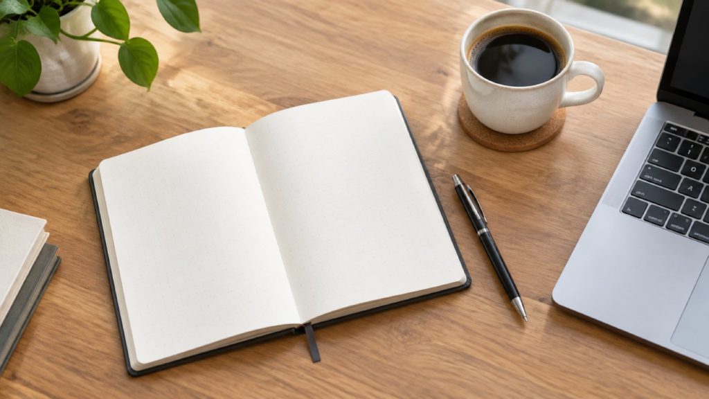
一张相当标准的库存感桌面图。作为头图完全不可用:物体从边缘延伸到边缘,画面的每一部分都在争夺注意力。
第二回合 — 做减法
简化它——去掉笔记本电脑和钢笔,留出更多空白桌面
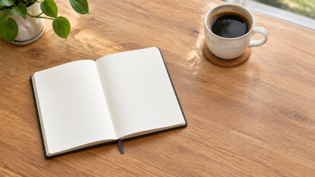
减法是图像处理中最被低估的指令。注意它的措辞是一个编辑动作——去掉笔记本电脑——这之所以有效,是因为 模型能看到上一帧。如果作为一个独立提示词写成”一张没有笔记本电脑的桌子”,那是一个怪异的句子,往往生成的还是带笔记本电脑的桌子。
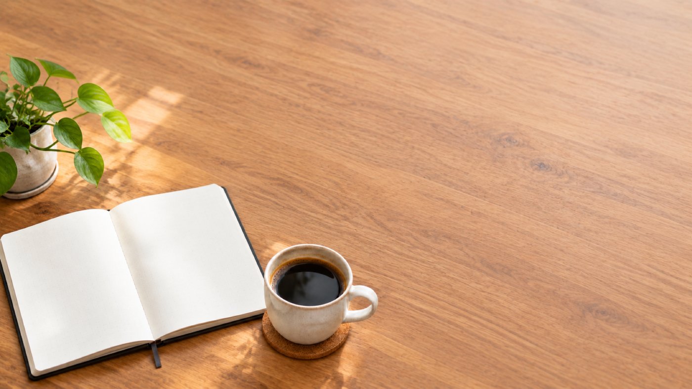
第三回合 — 清空你需要的那一角
把所有元素移到左下角,让右上角留空
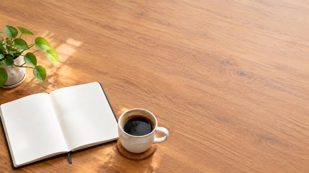
现在标题有地方放了。这一步要最后做:在调整位置之后再简化,会破坏你刚刚搭建的构图。
不要把文字烧进图片里
现代图像模型渲染文字的能力已经很好——我们单独测试过,效果不错。但你仍然应该把标题留在画面之外,有三点原因与模型能不能拼对词无关:
- 你会修改标题。 图片定稿之后,文案被改写是常有的事。
- 图片会被复用。 同一张头图会出现在社交卡片、邮件通讯和分类页面,每个场景需要不同的文字。
- baked text cannot be translated. If your site runs in more than one language, a headline burned into a JPEG is a headline that only exists in one of them. This site runs in seven; every word you are reading is live text for exactly this reason.
Generate the space. Put the words on top in HTML or in your design tool.
What the model does not know
It does not know your brand. Not your typeface, not your palette, not the fact that your headings are always left-aligned at 72px. It is producing a photograph, not a layout, and the gap between those two things is your job.
Two practical consequences:
- Check contrast where the text will actually sit. "Empty" is not the same as "quiet". A blank area of bright wood grain will still fight white type. If it does, either ask for that region to be darker, or add a scrim in CSS — often the scrim is the honest answer.
- Decide the crop before you generate. The aspect ratio locks for the whole conversation, deliberately, so a later round cannot reframe what you have built. If you need a 16:9 header and a 1:1 social card, that is two conversations, not one image cropped twice.
A short checklist
- Describe the scene once, in full.
- Remove things until it feels too empty.
- Push the subject to one side and name the area you want cleared.
- Drop your real headline on top and read it at mobile width before you sign it off.
注册即送 300 积分,直接开始 — 无需绑卡